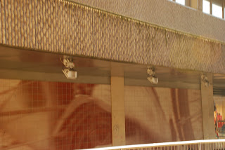
This is an obvious bad photograph there is lack of a decent composition, no focus and the colour of the overall photograph is too bland and there is an obvious lack of contrast.

This photograph is one from a whole series I took on journeys. I feel that it really doesn't work as an image. Firstly I feel that the van outside the window takes up too much of the frame and the fact that it is blurred doesn't make it look any better or any more successful. The use of the window as a frame does work in the other images I took but in this particular image the poster above the top of the window is too intrusive and is too distracting in my opinion.

This image was an attempt to show two lives entwined together. I was attempting to show this through two sets of different books on two different topics but I feel this has very obviously failed. The second set of books is too much out of the composition and out of focus and the overall angle of the photograph doesn't work and the image just looks too boring.
No comments:
Post a Comment